Support analytics (light mode) - Maxim Kuznetsov
Support analytics (light mode)
@disarto_max探索从 X 精选的仪表盘 UI 设计灵感,包括分析页面、数据产品、管理面板和 SaaS 界面。
Support analytics (light mode)
@disarto_maxLiquid Mask – Cursor FX Source Code & Demo: https://codepen.io/editor/sabosugi/pen/01a08674-961d-779f-b73c-527fd4ef0f1c?file=%2Findex.html%3A162%3A153&orientation=right&panel=file...
@sabosugiaudience data
@moguzbulbulour new onboarding experience on Open Analytics @openanalyticshq
@uaghazadaeNew FREE section just dropped on our platform https://annnimate.com/animations A stable for all saas marketing sites out there. As per usual filled with lots of tiny details. Go g...
@juli_fella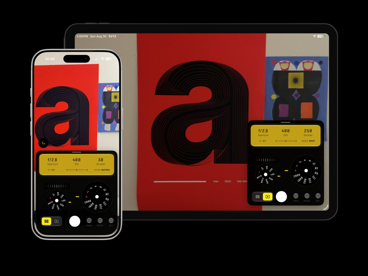
EV13 1.3 is here. A modern light meter app for film photographer. This update supports more devices include iPad. Customize floating control panel, camera zoom support and more. G...
@radiofun8Introducing Motion Anime. A curated collection of springs, skids, fluid micro-interactions for your UI. Now you can add beautiful, interactive charts to your app with a single CLI...
@SubhanHQBreaking down a 30s SaaS launch video: → Hook + Pain Point → Solution / Value Prop → Features + Differentiators → CTA Every section has a job. Don’t just animate the script. Turn...
@Ali_edit0been working on some cinematic dashboard animations all the little details that turn a static interface into something with more depth and energy
@mnowakdesignRemocn introduces a new set of text animations used by popular SaaS products. How do I know? Because I analyzed dozens of videos from my bookmarks on X and recreated the animation...
@_remocn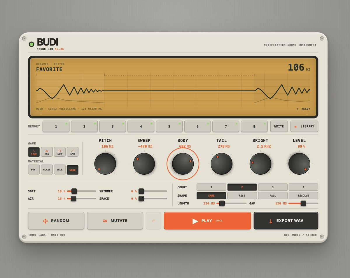
i need to throw some love at my controls ai is awesome but i struggled with working on a few demos at once before. now that's 10x because i can jus' speak my ideas into a bunch of...
@jh3yy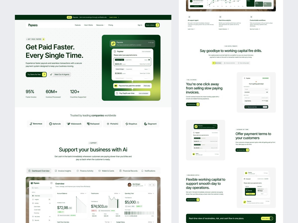
SaaS Landing Page Design
@sajiburdesignIntroducing Velora Footer Designed to match the style of the Velora Navigation, with a clean and modern look that fits almost any SaaS. Copy it for free
@tilljanekcharts are here for @boardui funnels, pie charts, combo charts, radar charts: all you need and more.
@sitenleySandbox Limits: a panel for starving a job. pull the cpu and memory ceilings, hit run, see if it finishes or gets killed. when usage hits the cap the line isn't a ruler. it's a be...
@jeetnirnejak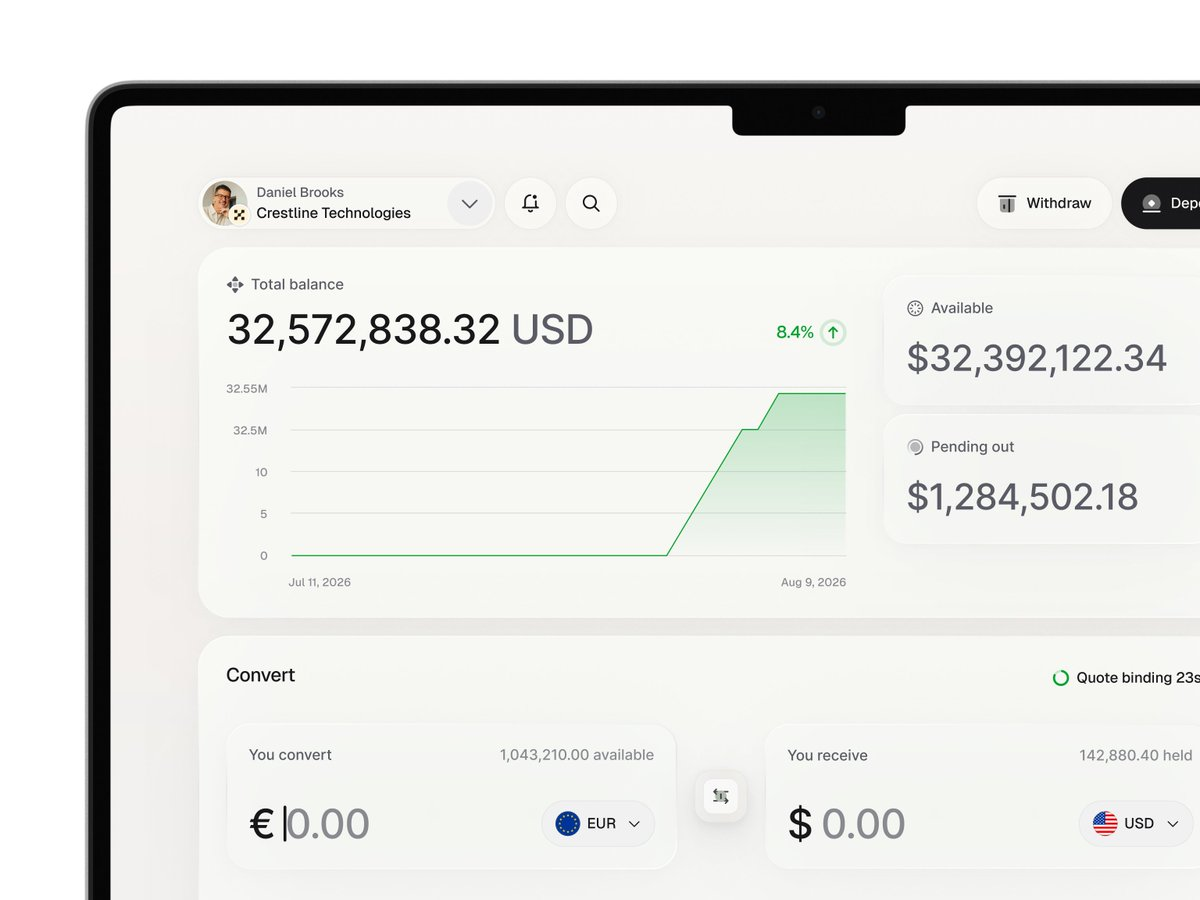
Dashboard Analytics UI
@gabriell_lab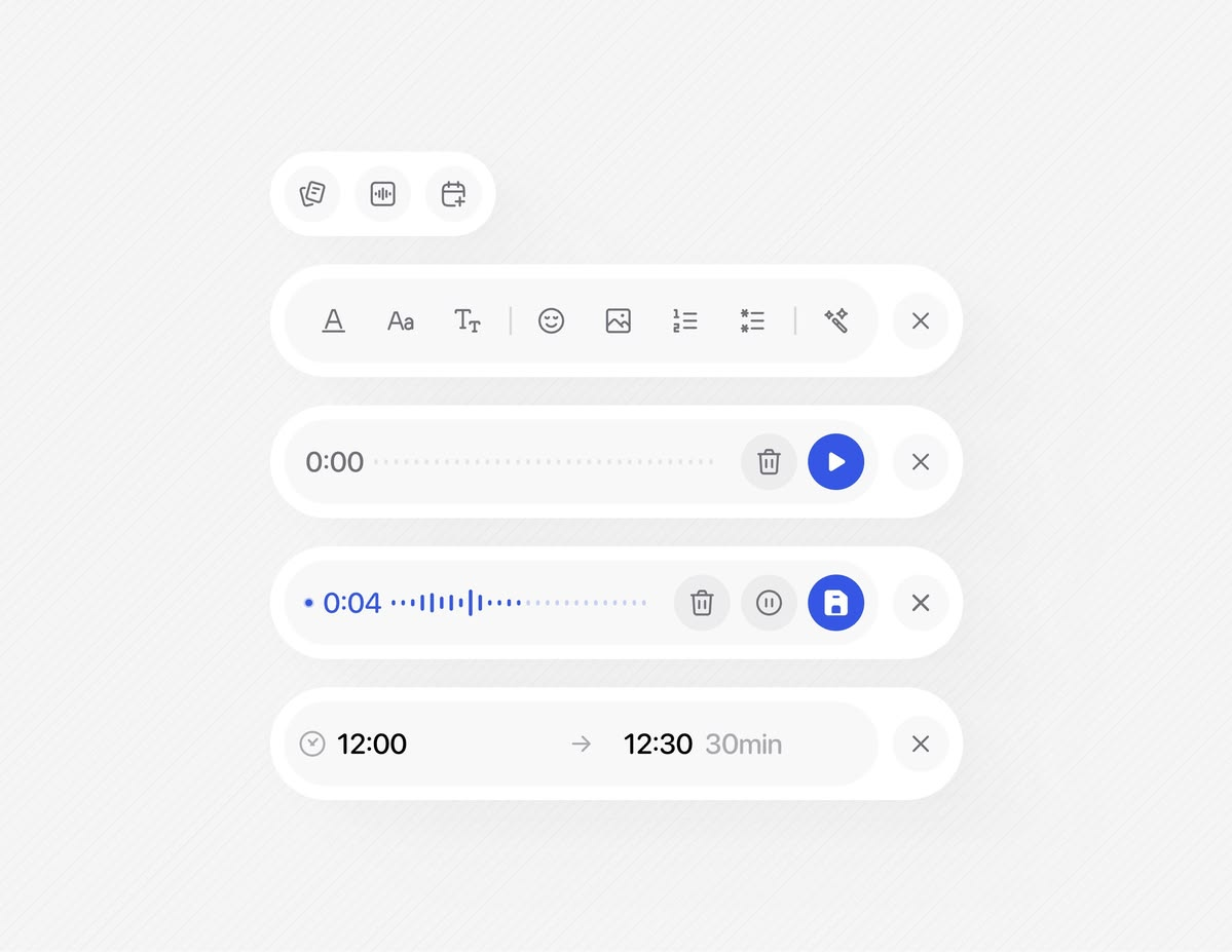
Really love these components.
@abid_led_designIntroducing Motion Corner Menu A compact floating button that expands into a complete navigation panel with links, contact details, social icons, and a CTA. Built entirely native...
@Matthias_OelAnother brand exploration we did for DatawizzAI - probably my favorite of the bunch @designme
@adriankuleszoI heard you on pricing. Kobbe web analytics is now cheaper at every tier, 1M events dropped from $79 to $20/mo. Still cookieless, GDPR-ready, and every feature on every plan. http...
@Mike_AndreuzzaDiagnosync Widgets – AI Features in Action
@ZaydenSaaSgtfsIntroducing Mono Charts. A collection of minimal, animated chart components for React. Now you can add beautiful, interactive charts to your app with a single CLI command. Part of...
@SubhanHQI built a full SaaS landing page with @framer Agent in 7 prompts. Custom animations, scroll effects, hover interactions, 10 sections, fully responsive. The credit usage surprised...
@tranmautritam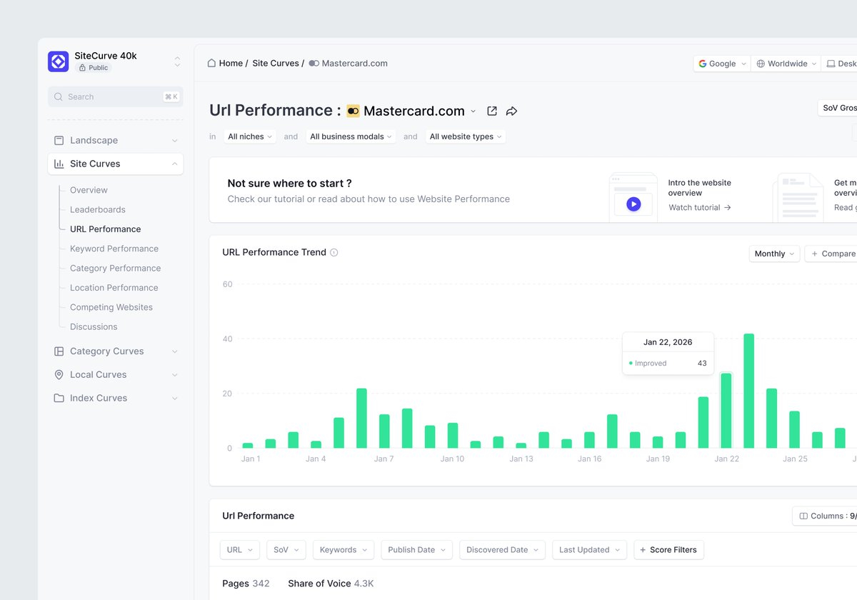
Url performance trend analytics
@omererdgan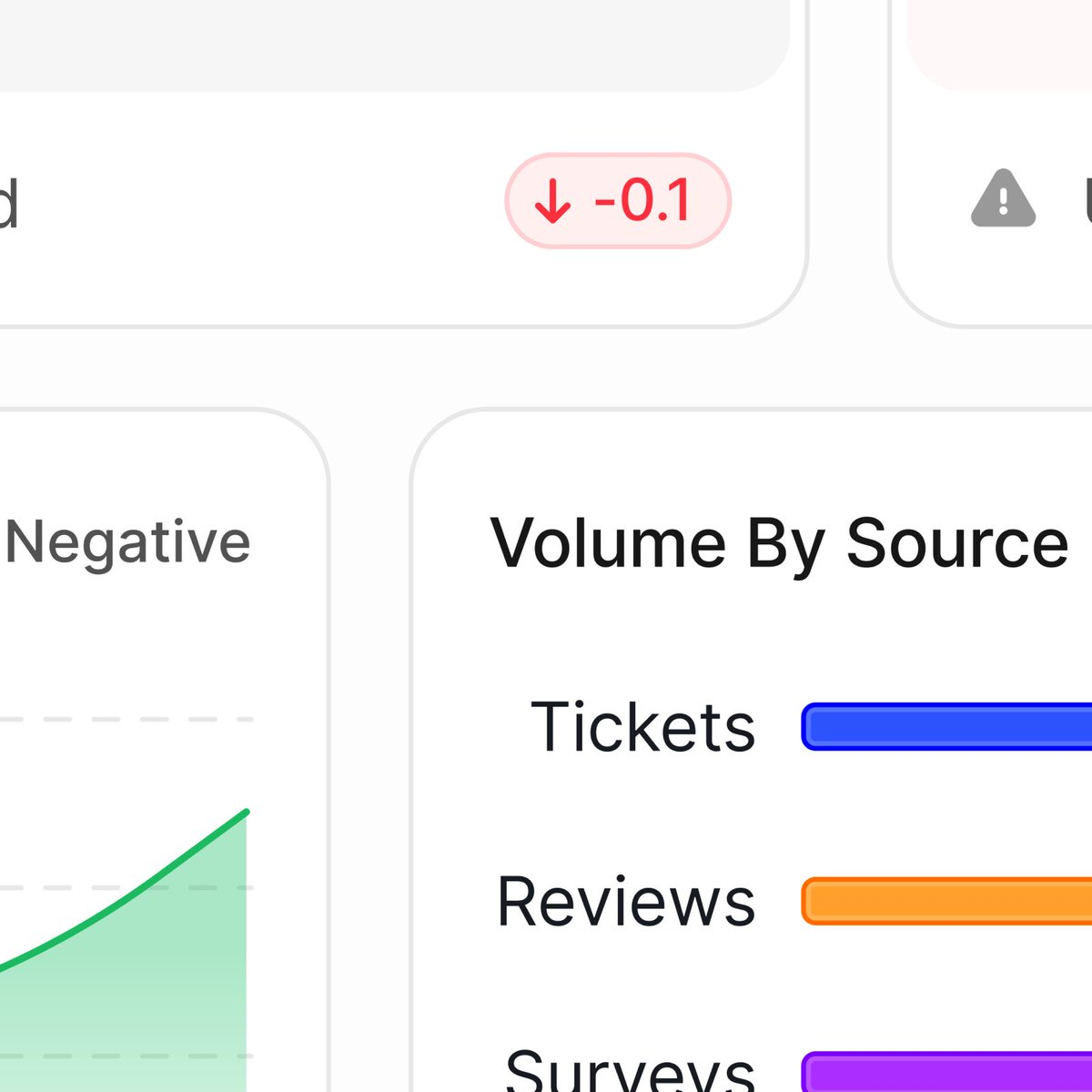
Users see a dashboard. Designers see 500 micro-decisions about padding, hierarchy, and contrast. Sweating the details on this one.
@mnowakdesignglass charts
@alyx_sowe're working on a new filter system for the @vercel dashboard coming soon to our deployments pages
@witsdev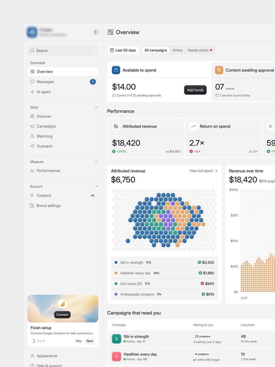
I can proudly say "WE DESIGN BEST DASHBOARDS"
@AbrarInPixelsA clean mobile finance dashboard mockup shows balance stats, a weekly bar chart, and withdraw and add money actions.
@alexvanderzonA tight collection of technical micrographic compositions featuring data-inspired typographic lockups and custom iconography rendered in stark white on black.
@evanplaceAn editorial cover design for issue 02 of Endless, mixing bold red panels, expressive script type, and a green-painted grinning face over a repeating 2026 text field.
@jayrizpopAn experimental motion piece overlaying floating semantic data nodes and probability values onto two reaching hands, blending classical visual reference with glitchy AI-inference...
@__causasuiA concept AI chat interface where responses stream in with handwritten-style highlights, circled figures, strikethroughs, and progressive chart reveals to feel more natural and hu...
@nilsellerAn iPhone fitness route replay shows a walking workout traced over a 3D city map with detailed stats and elevation data.
@hieudinh_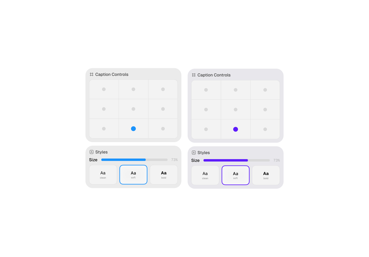
A clean dual-panel interface mockup shows caption controls and text style options in a soft, minimalist layout.
@Metagravity0A dark cinematic website presentation for Henry Labs with glowing gradients, embedded checkout sections, and dashboard-style product visuals.
@dakshpixelupA clean typographic explainer pairs body text with an interactive spacing chart to show how line length affects leading.
@joshpuckett
A dark minimalist interface mockup with floating controls and a compact changes panel.
@benjaminnathanA dark movie discovery interface pairs a minimalist search panel with a rotating poster wall of film covers.
@vamsibatchukA playful onboarding interface mixes bold type, stacked content cards, and a dark settings panel with live color controls.
@joshpuckettA dark glassmorphism interface mockup is warped by ripple-like distortion across its panels and controls.
@benjaminnathantheme settings panel + accent color picker
@shedsgnsA glossy pastel toggle animation with soft 3D shading and a clean minimal look.
@ZaydenSaaSgtfsA minimalist banking app interface shows a virtual card details panel with a lock toggle and frosted card reveal.
@tcostaA clock app concept with an analog watch face and theme-switching preferences panel cycling through dark, light, and yellow color modes.
@itshasscoAn experimental motion piece featuring glowing figure silhouettes animating through dynamic poses against a heavily glitched, pixelated blue and red datamosh background.
@cemhah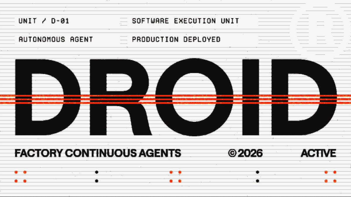
A retro-futurist identity system built from oversized type, terminal-style labels, and vivid orange panels for Factory.
@kyleanthonyA playful music app interface built around a 3D album-cover carousel and detailed track panels.
@liuyi0922A branding slideshow showcasing different pieces with bold typography and retro-futuristic system panels.
@kyleanthonyA playful 3D-rendered handheld gadget concept featuring modular controls and a tiny screen cycling through waveform, spectrum, and telemetry data views.
@DilumSanjayaAn iOS analytics app replaces a blank loading screen with a real-time animated counter and chart that visually updates as metrics are fetched day by day.
@andrewtanchukA looping 3D motion study featuring iridescent bar-chart columns morphing between arc and M-shaped formations with prismatic blue and purple lighting, created as hero art for a mo...
@benfrycA compound interest calculator screen for the Aave mobile app, featuring a draggable chart handle and deposit slider that update projected savings values in real time.
@alexvanderzonA glassmorphism-styled terminal window on Arch Linux featuring frosted semi-transparent panels over a cherry blossom wallpaper, showing neofetch system info with a dreamy aestheti...
@iyoushetwtA clean animated data dashboard showcasing key financial metrics with purple gradient charts that build into view, presenting stats like $1B interest paid and $3.23T in cumulative...
@AnaArsonistA clean expand interaction for an AI thinking panel that animates open to reveal model comparison details including context, reasoning stages, and completion time.
@shedsgnsAn experimental portfolio website for Ben Paine's creative development and design practice, featuring collaged imagery, 3D wireframe panels, and minimal monospace typography.
@bnpne_We've added an OG image Analyzer in ogfolio!
@dudufolioFinance doesn't have to be boring
@privetavdey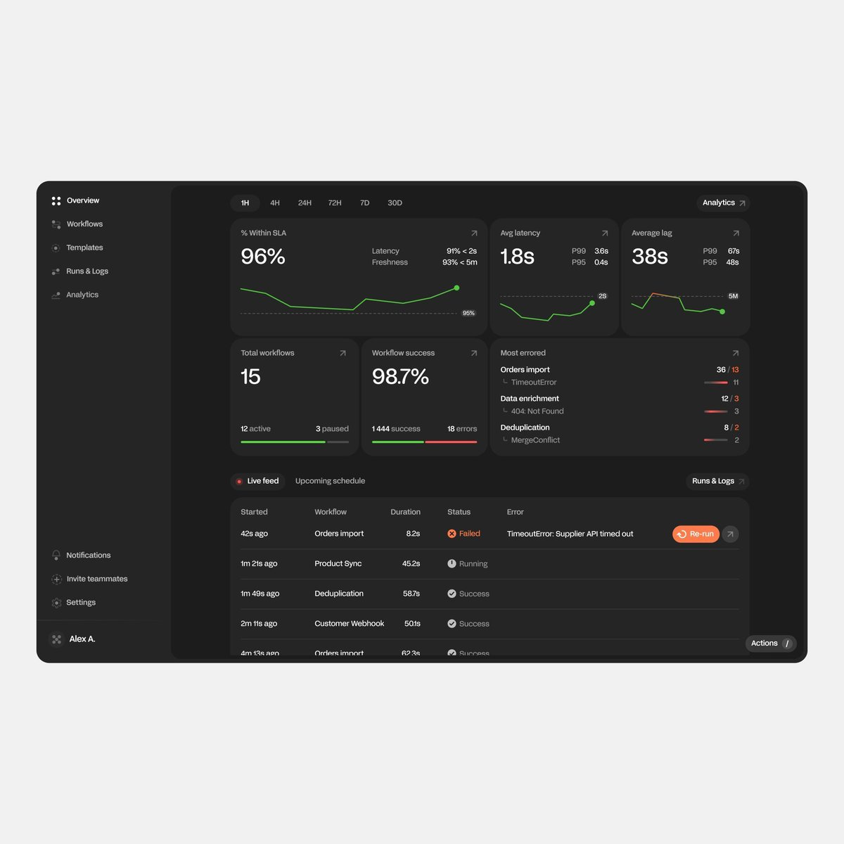
I heard you like dashboards
@privetavdey